Vermont Farm - Step 4
Oil 20" x 20"
Day 12 in the 30 in 30 Days Challenge
Yesterday I talked about the front of the corn field, whether or not to continue the corn, or have it be a fallow field of something else. After thinking about this for awhile I kept it all corn. The focal point of the painting is the farm and I felt that something different in the front would draw the viewers eye to the bottom of the painting away from the buildings. With just freshly cut cornstalks in the entire front, the rows are similar which is a calmer feeling. (Freshly cut corn stalks are a challenge to paint! These look like they could be freshly cut anything, but that works as they are not the main subject matter.) I feel that I now have a better composition. The rows take your eye from the bottom of the painting up to the corner of the subject mass and then across the buildings, up the left side of the silo, round the top, down the right side and back into the buildings.
I've started putting the colors into the buildings. I painted the biggest darkest mass first, (sometimes I paint the lightest mass first) the shadow side of the big barn, then the silo next to that. I previously talked about the relationship of the color masses next to each other..even though I got the silo values pretty accurately, it now looks to me that the shadow side of the silo may not be dark enough and the light side is almost the same value as the sky. A color isn't accurate until seen in relationship to the color mass next to it! So, now I'm going to have to spend awhile looking at and thinking about those two areas. But, until I get the rest of the barn painted I won't know if the shadow side is right!
Sunday, January 12, 2014
Saturday, January 11, 2014
Vermont Farm - Step 3
Oil 20" x 20"
Day 11 of the 30 in 30 Days Challenge
After blocking in the values of the farm: the barns, houses and trees, I next put in the colors surrounding that mass. While I tried to portray the values of the farm accurately, no color is true until seen next to the color beside it. So, had I painted the farm first, I would have probably had to make color changes. I still might have to. But, by putting the colors in all around the farm it will help me when putting down the color notes.
I've left the front empty for the moment. In the photo there's a road in the front. In my preliminary sketch I drew the lines for corn stalks as if to continue the field. But when I got the darker under green down, I wondered how it would look if I painted that as a fallow field. So, I'll think about that for a bit and then decide.
Oil 20" x 20"
Day 11 of the 30 in 30 Days Challenge
After blocking in the values of the farm: the barns, houses and trees, I next put in the colors surrounding that mass. While I tried to portray the values of the farm accurately, no color is true until seen next to the color beside it. So, had I painted the farm first, I would have probably had to make color changes. I still might have to. But, by putting the colors in all around the farm it will help me when putting down the color notes.
I've left the front empty for the moment. In the photo there's a road in the front. In my preliminary sketch I drew the lines for corn stalks as if to continue the field. But when I got the darker under green down, I wondered how it would look if I painted that as a fallow field. So, I'll think about that for a bit and then decide.
Friday, January 10, 2014
Composition and Value Step 2
Oil 20" x 20"
Day 10 in the 30 in 30 Days Challenge
Yesterday I posted my preliminary sketches for this Vermont farm scene. This is step 2 where I painted in the buildings and values. The palette I chose for the values was the leftover gray pile from a previous painting. Almost any palette will work for the values. Some people have strict value palettes that they always use. Many people use a warmish value palette. I just grabbed what was there. I like toning my canvas with warm colors. Other artists use a neutral gray as a tone, but I love bits of warmth peeking through.
If the values in a painting are correct, it doesn't really matter what colors you use. At this point this could be a farm with red barns, green barns, old gray faded barns. If you paint the values fairly thin you often can just start painting right on top of them without the colors mixing too much.
As I said yesterday about not always doing a preliminary sketch, I don't always do a preliminary value study. Value is the relative degree of light and dark, or grayness from black to white. Sometimes that can be confusing because we don't see things in shades of gray, but in light and dark colors. So sometimes it's just as easy to block shapes in as colors. Both of these are great learning steps and something all artists do at different points.
Another book that I love is Kevin MacPherson's Fill Your Oil Paintings With Light & Color. It is much easier to read and understand than the two I mentioned yesterday. And is filled with so much great information and exercises. I highly recommend it.
Oil 20" x 20"
Day 10 in the 30 in 30 Days Challenge
Yesterday I posted my preliminary sketches for this Vermont farm scene. This is step 2 where I painted in the buildings and values. The palette I chose for the values was the leftover gray pile from a previous painting. Almost any palette will work for the values. Some people have strict value palettes that they always use. Many people use a warmish value palette. I just grabbed what was there. I like toning my canvas with warm colors. Other artists use a neutral gray as a tone, but I love bits of warmth peeking through.
If the values in a painting are correct, it doesn't really matter what colors you use. At this point this could be a farm with red barns, green barns, old gray faded barns. If you paint the values fairly thin you often can just start painting right on top of them without the colors mixing too much.
As I said yesterday about not always doing a preliminary sketch, I don't always do a preliminary value study. Value is the relative degree of light and dark, or grayness from black to white. Sometimes that can be confusing because we don't see things in shades of gray, but in light and dark colors. So sometimes it's just as easy to block shapes in as colors. Both of these are great learning steps and something all artists do at different points.
Another book that I love is Kevin MacPherson's Fill Your Oil Paintings With Light & Color. It is much easier to read and understand than the two I mentioned yesterday. And is filled with so much great information and exercises. I highly recommend it.
Thursday, January 9, 2014
Composition and Value
Day 9 in the 30 in 30 Day Challenge
As I stated when I started the 30 in 30 Challenge, although I paint a lot, I don't paint every single day, and I don't paint that many small paintings. But, I like a challenge and I like to make things work. So, this week I'm working on a 20 x 20 of a farm from our visit in September to Vermont. Everyday I'll post about 1 to 2 hours worth of work until I'm done.
One of the fundamentals of drawing and painting that can be challenging is composition. We know that a painting needs a good composition to work. But, what makes a good composition? When you look at the work of a master in a museum, why does it stand out? What piece in a gallery really draws you? Sometimes it's the strong light, sometimes it's the bold or subtle value and color, sometimes it's the great composition. There's a lot more to a painting than just painting.
Very basically composition is the placement of the dominant mass(es) and line(s). I like the movement in the upper right sketch because the lines of the cornfield move up to the mass of the shape of the farm.
As many of us do, I have a lot of art books. Two of my favorites are Composition of Outdoor Painting by Edgar Payne and Carlson's Guide to Landscape Painting by John F. Carlson. I was much newer to painting when I first got these and found them hard to get through. I've read and reread them (sometimes only a chapter or two at a time) over the years and appreciate all that they teach. I love Paynes' drawings for his suggestions for design. They are so helpful when landscape painting. Carlson also has diagrams showing dominant mass and line schemes.
I don't do sketches like this with every painting, although I probably should do more. I knew that I wanted to paint some of the barns and farms in Vermont. I took so many photos that had good starts for a painting but needed work. So I spent quite awhile just editing photos, before I even got to sketching. After I picked four that I liked and thought would work I tried to get the composition working on the photo, then adjusted it as I sketched. I don't always grid my sketches, but find that that is helpful with architecture. By the time I got to the end of these 4 sketches I'd probably been working for about 2 hours. I'm not used to photoing white, so the values don't show up very well.
Day 9 in the 30 in 30 Day Challenge
As I stated when I started the 30 in 30 Challenge, although I paint a lot, I don't paint every single day, and I don't paint that many small paintings. But, I like a challenge and I like to make things work. So, this week I'm working on a 20 x 20 of a farm from our visit in September to Vermont. Everyday I'll post about 1 to 2 hours worth of work until I'm done.
One of the fundamentals of drawing and painting that can be challenging is composition. We know that a painting needs a good composition to work. But, what makes a good composition? When you look at the work of a master in a museum, why does it stand out? What piece in a gallery really draws you? Sometimes it's the strong light, sometimes it's the bold or subtle value and color, sometimes it's the great composition. There's a lot more to a painting than just painting.
Very basically composition is the placement of the dominant mass(es) and line(s). I like the movement in the upper right sketch because the lines of the cornfield move up to the mass of the shape of the farm.
As many of us do, I have a lot of art books. Two of my favorites are Composition of Outdoor Painting by Edgar Payne and Carlson's Guide to Landscape Painting by John F. Carlson. I was much newer to painting when I first got these and found them hard to get through. I've read and reread them (sometimes only a chapter or two at a time) over the years and appreciate all that they teach. I love Paynes' drawings for his suggestions for design. They are so helpful when landscape painting. Carlson also has diagrams showing dominant mass and line schemes.
I don't do sketches like this with every painting, although I probably should do more. I knew that I wanted to paint some of the barns and farms in Vermont. I took so many photos that had good starts for a painting but needed work. So I spent quite awhile just editing photos, before I even got to sketching. After I picked four that I liked and thought would work I tried to get the composition working on the photo, then adjusted it as I sketched. I don't always grid my sketches, but find that that is helpful with architecture. By the time I got to the end of these 4 sketches I'd probably been working for about 2 hours. I'm not used to photoing white, so the values don't show up very well.
Wednesday, January 8, 2014
That's My Buoy!
That's My Buoy!
Oil 8" x 6"
$100.00 + $10. s/h
Day 8 in the 30 in 30 Days Challenge
Oil 8" x 6"
$100.00 + $10. s/h
Day 8 in the 30 in 30 Days Challenge
I loved all of the buoys I saw hanging on walls, resting in piles on the ground and loaded onto trucks readying for "Trap Day" on our fall trip to Monhegan Island, Maine. I also loved the reflections of the buoys in the water. I was told by someone who goes out to Monhegan Island every year to help on Trap Day that you can tell who owns the buoys by their colors. That was something new to me, but which made such sense once I'd heard it. So, I wondered about the exact color of this buoy. It's old and needs to be repainted. I'm sure it's seen many seasons in the water. But, I guess that the lobstermen know exactly which ones are theirs and thus the title..."That's My Buoy"!
Tuesday, January 7, 2014
Summer Sun
Summer Sun
Oil on cradled panel 12" x 12"
$295.00 + $10. s/h
Day 7 in the 30 in 30 Challenge
Our summer garden has different kinds of tall sunflowers. I'm sure they each have names which I don't know. This one, which we have more of, reminds me of large daisies. Whereas the one I posted yesterday seems more like the typical sunflower. Because this one has smaller seeds it attracts more of the smaller birds.
I love this quote: "The good life is lived best by those with gardens." I guess I have a good life! This quote came from one of the books our son gave me for Christmas: An Absorbing Errand, How Artists and Craftsmen Make Their Way To Mastery by Janna Malamud Smith. One of the chapters talks about the similarity of gardening and art. She talks about how life is better when you have a continuous practice that "holds your desire, demands your attention and requires effort" like gardening. What a great chapter. I grew up in a family of gardeners. Long before I painted I planted and nurtured gardens. It was something that was so easy to do while our kids played in the yard. No one plays in our yard now, the garden gets less nurturing, most of my attention and effort goes toward my painting. But my life is still good because as she says "The good life is lived by those with gardens!"
Monday, January 6, 2014
Following The Sun
Following The Sun
Oil on cradled panel 12" x 12"
$295.00 + $10 s/h
Oil on cradled panel 12" x 12"
$295.00 + $10 s/h
Day 6 in the 30 in 30 Challenge
With so much of the country having cold weather ....18 degrees and 4 inches of snow here in Colorado Springs...I thought that I'd post some paintings from our garden this past summer. We always grow a huge patch of sunflowers in the middle of the yard. Actually, we don't plant the sunflowers anymore, they reseed themselves every year. They grow to over 10 feet and sit in a raised garden. This is so great! While sitting on our deck we can look right at them and enjoy their color as well as all of the birds that they attract.
This was our yard last July.
Sunday, January 5, 2014
Early To Rise
Early To Rise
Oil 8" x 8" on cradled panel
$195.00 + $10. s/h
While we were in Maine this past fall, we spent several nights in the Rockland/Rockport area. Two mornings I got up early to head out for sunrise photos. This man was in the Rockport Harbor. Early mornings in the harbor are quiet, but yet there's so much going on. There were other people taking photos, lobstermen heading out, fisherman on the docks, trucks pulling up. And with the light changing by the minute there were never endless photo opportunities.
I'm not sure if this title refers to this guy, or to me. I guess it's for both of us!
Oil 8" x 8" on cradled panel
$195.00 + $10. s/h
Day 5 in the 30 in 30 challenge
While we were in Maine this past fall, we spent several nights in the Rockland/Rockport area. Two mornings I got up early to head out for sunrise photos. This man was in the Rockport Harbor. Early mornings in the harbor are quiet, but yet there's so much going on. There were other people taking photos, lobstermen heading out, fisherman on the docks, trucks pulling up. And with the light changing by the minute there were never endless photo opportunities.
I'm not sure if this title refers to this guy, or to me. I guess it's for both of us!
Friday, January 3, 2014
Let's Hear It For The Buoys
Oil 14" x 11"
#3 of 30
$295.00 + $10 s/h
These buoys were hanging in Port Clyde, Maine where we got the ferry to Monhegan Island. In the summer ferries run from three ports. In the fall Port Clyde is the only ferry port. We got to Port Clyde a bit early which allowed us to walk around town. That didn't take too long as there are only about 4 streets. These buoys were on a "back" street...ok on "the" back street on the side of a an old weathered house with just a bit of sun shining on them. I knew that I was going to paint buoys and took lots of pictures of them. I took lots of pictures of everything New England-y!
This title is dedicated to Deniece Williams. "Let's Hear It For The Boy" was the 2nd number 1 song for her and appeared on the soundtrack to the 1984 movie Footloose. It climbed to #1 on the US Billboard Hot 100 as well as being nominated for an Academy Award for Best Song.
Thursday, January 2, 2014
Buoys Will Be Buoys
Buoys Will Be Buoys
Oil 14" x 11"
$295.00 + $10. s/h
2 of 30 in the 30 in 30 January painting challenge.
Oil 14" x 11"
$295.00 + $10. s/h
2 of 30 in the 30 in 30 January painting challenge.
This is another piece from our fall trip to Maine. I found this group of buoys on Monhegan Island. I was walking around looking for a house to paint when these "guys" just jumped right out at me. They were bold, bright, right in the sun.
Wednesday, January 1, 2014
Rocking The Boat
Rocking The Boat
Oil 12" x 12"
$295.00 + $10. s/h
Oil 12" x 12"
$295.00 + $10. s/h
Speaking of a great way to start the year....last winter I had knee replacement. Unfortunately, I was in the 1% that doesn't have an easy recovery. I had scar tissue issues, swelling, frozen muscles. By the spring I had a second procedure. And again had issues. I spent the summer going through 3-5 hours of physical therapy each day. This included going to pt, going to warm water aerobics, going to the gym, doing pt at home, and sitting in leg braces 2 hours each day. To say the least, it was not fun. By Labor Day I'd about had it and went to the Victor Celebrates The Arts event. At that point I was better, but not yet there. In late September/October we went to New England for 3 weeks. Once again I walked/hobbled around, took one of my braces with me, and tried to live my life. I loved every minute that I was able to paint on those 2 trips. Upon returning another surgery was scheduled, which I just had in December. And, happily it went well. In one day I was already better than I was after 7 months! And now, I'm so ready for the New Year!
Tuesday, December 31, 2013
Happy New Year!!
Shaken, Not Stirred
Oil 8" x 6"
$100.00 + $10. s/h
Oil 8" x 6"
$100.00 + $10. s/h
Here's to you all having a Happy New Year! May 2014 be a great year! Thanks to all of my blogger friends for all of your friendship and support!
Sunday, December 29, 2013
Up The Creek - SOLD
Up The Creek
Oil 8" x 6"
SOLD
Just went and picked up paintings from the holiday show at G44 Gallery 1785 S. 8th Street Colorado Springs, Colorado 80905. This one was purchased as a gift for a man who loves fishing here in Colorado! Love it when I know where a painting goes! Thanks G44!
As I did last January I'm hoping to participate in Leslie Saeta's 30 in 30 paintings. I don't paint every single day, and I don't paint that many small pieces in a month. But, once again, I think that I can post the daily steps in my larger paintings. It's a great way to start the year, and I'm one to adjust things a bit to work for me. Look for this in January!
Oil 8" x 6"
SOLD
Just went and picked up paintings from the holiday show at G44 Gallery 1785 S. 8th Street Colorado Springs, Colorado 80905. This one was purchased as a gift for a man who loves fishing here in Colorado! Love it when I know where a painting goes! Thanks G44!
As I did last January I'm hoping to participate in Leslie Saeta's 30 in 30 paintings. I don't paint every single day, and I don't paint that many small pieces in a month. But, once again, I think that I can post the daily steps in my larger paintings. It's a great way to start the year, and I'm one to adjust things a bit to work for me. Look for this in January!
Thursday, December 19, 2013
Just After Dawn
Just After Dawn
Oil 20" x 20" on stretched canvas ready to hang
$495.00 + $20. s/h
This is another painting done from photos I took on our fall trip to Maine. We left our motel at about 6:25 and just made the sunrise. This is just outside of Rockland.
I love the way this sunrise piece turned out. I started with a canvas toned in a bold pink. Then there are several layers of color scumbled on after each layer dried. I've got to go through my photos and see if I have anymore sunrise shots over water! I have lots of mountain and plains sunrises, but I love the colors in the water reflections.
Sunday, December 15, 2013
Much Needed Rest
Much Needed Rest
Oil 12" x 12"
$295.00 + $10. s/h
Oil 12" x 12"
$295.00 + $10. s/h
This is another studio piece done from our trip this fall to Maine. I loved the evening light on the water around the lobster boat.
Friday, December 6, 2013
Thursday, December 5, 2013
Wednesday, December 4, 2013
Monday, December 2, 2013
Saturday, November 30, 2013
Monday, November 25, 2013
Working Boat
Working Boat
Oil 11" x 14"
SOLD
Oil 11" x 14"
SOLD
Many of my recent studio pieces have been paintings done from photos of our trip in September/October to Vermont, Maine and Nova Scotia. I've posted all of the plein air work, so now I'll be posting the studio work.
I loved seeing all of the lobster boats, row boats and dinghies, buoys, and harbors. All things that we don't have here in Colorado! All things that I've been painting!
The harbors were filled with working boats. To me, being a lobsterman must be a hard, hard job!
Friday, November 22, 2013
Weathered Gray Shingles
plein air oil from Monhegan Island
8" x 10"
25 off of 25
$149.00 + $10. s/h
plein air oil from Monhegan Island
8" x 10"
25 off of 25
$149.00 + $10. s/h
This is the last of the plein air pieces that I painted last month on Monhegan Island, Maine. Most of the buildings n the island were weathered gray or white. For those of you who have gone there and painted, I certainly understand why. For those of you who've commented that you hope to go there some day, I certainly understand why. It is truly a wonderful place. Look for the studio pieces that I've been working on since we've been back.
Besides all of the incredible scenes to paint, there are miles of trails to hike. Sometimes while I was painting my husband would hike. Other times I hiked, too. One of my favorite hikes was out to the "Enchanted Forest." As you hike along there are dozens and dozens (if not hundreds) of little fairy houses built under tree roots, at the base of trees, behind rocks, on branches. It's amazing. You turn your head and there's another one!
Here are a few of them!
Wednesday, November 20, 2013
The Keeper's House - On Monhegan Island
The Keeper's House (near the lighthouse)
plein air oil from Monhegan Island
6" x 8"
25 off of 25
$75.00 + $10. s/h
Monhegan Island, Maine is an incredible place. I've been talking and posting about it the last few weeks. Because it's so small, you walk everywhere. And, everywhere you walk is another painting! I photoed this piece several times and just can't get the shadow side of the building to read as dark as it's painted. I'll keep trying!
The lighthouse keeper's house is now the Island Lighthouse Museum. You can go in this building
and the ice house, but not into the actual lighthouse. This station was built in 1824.
The lighthouse was built in 1850 and animated in 1959.
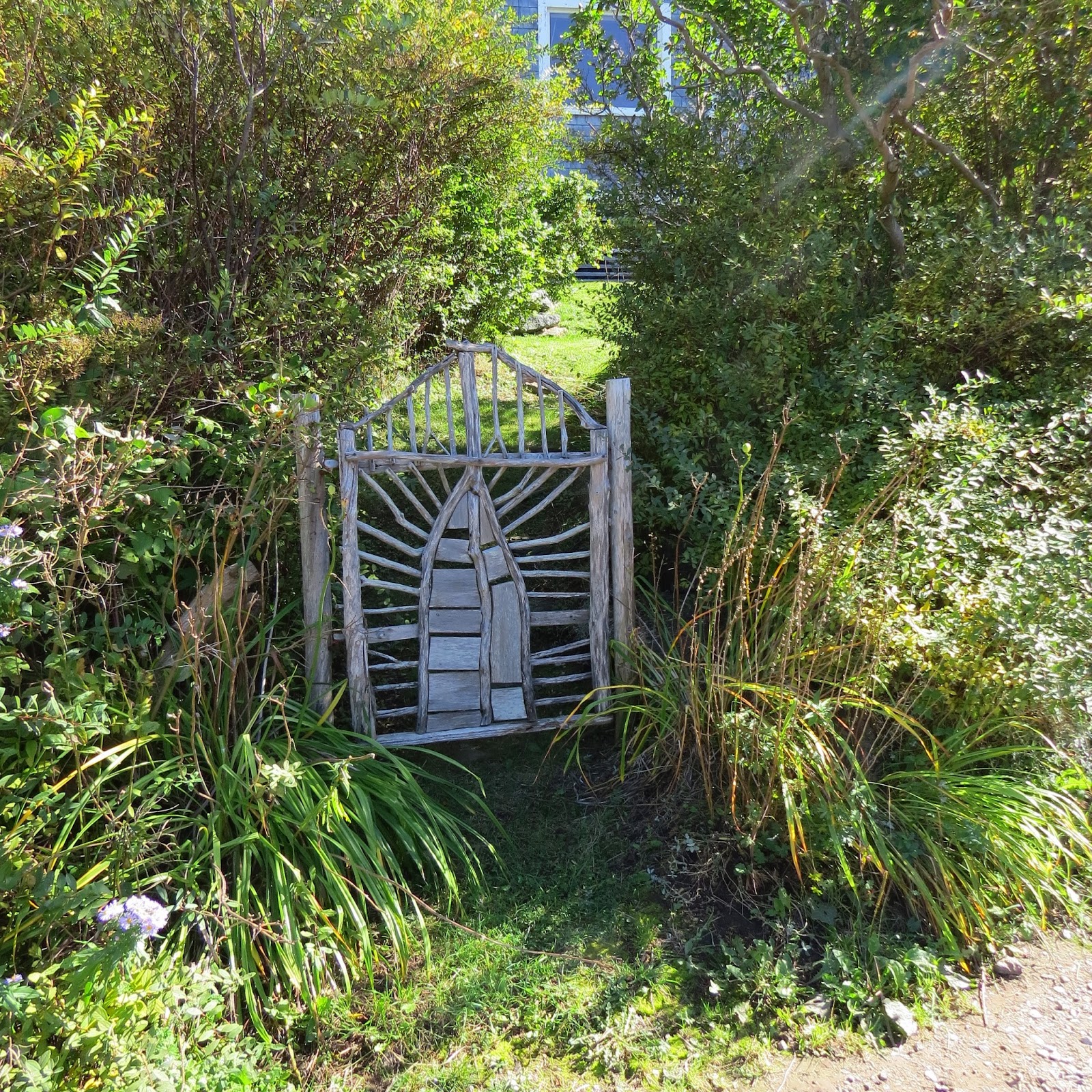
This gate was right by where I was painting!
Subscribe to:
Posts (Atom)